In Access: Why access can never be in excess
Unless you have some form of disability, it’s easy to overlook the accessibility of your website, or treat it like an afterthought. If you’ve never had any issues using or navigating websites, how do you even know what the problems out there are? But ignorance is not an excuse, and making products, especially websites, more accessible does not only improve the experience for people with disabilities, but it improves the user experience for everyone.
Let’s use Subtitles on videos as an example. This is something we all take for granted; however, it was originally an accessibility feature, intended for a small but important part of the population. Now, it’s an expected feature on every form of video and used by people of all abilities. Fully accessible websites can be just as empowering as subtitles on videos – and the onus is on us, as Web Designers and Developers, to make it happen!
The bad news is that there’s no shortcut to getting a fully accessible site. You have to follow the rules when it comes to coding and can’t gloss over mistakes or redoing, where required. But the good news is that despite being a slow process, it’s worth it and will result in an enhanced user experience for all.
The Challenge
It might feel like an impossible feat to even understand the rules. The WCAG documentation is detailed to a fault and reading it without context can feel like talking Greek. It requires a lot of researching and reading to wrap your head around – which, let’s face it, doesn’t tend to be a developer’s forte! Most tend to code first and fix mistakes later, which, while possible when working on accessibility, will require a lot of redoing codes and fixing mistakes. My advice would be to avoid undue stress and take the time to sit through the documentation before getting started!
All websites should aim for AA standard, which can prove challenging especially from a design perspective (i.e attention to detail of the colour contrast in all design elements.)
Top Tips For Building A Web Project
The best way to approach making an accessible website is to start by understanding the needs of your users. This means considering the different types of disabilities that your users may have and how these disabilities may affect their ability to access and use your website. Reading and understanding more about how a blind person navigates a website (by using a screen reader, for example) can guide you to make the necessary changes to your website. Try navigating a website using a screen reader and see how far you get. Once you have a good understanding of your users’ needs, you can begin to design and code your website in a way that meets these needs. It’s also important to test your website regularly using a variety of accessibility tools and techniques to ensure that it remains accessible as you make changes and updates.
- Use semantic HTML: As developers this gets talked about a lot, but only once you start trying to make a site fully accessible will it become clear why it’s so important. Semantic HTML elements provide information about the structure and meaning of your content. For example, using heading elements (<h1> through <h6>) to organize your content into sections can help screen reader users navigate your page more easily. Other important semantic elements include <nav> for navigation, <main> for the main content of the page, and <article> for individual pieces of content.
- Add ARIA labels and roles: Everything clickable must have aria labels. Forms can be a hurdle for accessible users. Make sure everything has a label and these labels are extremely specific on what you are expecting from the user. ARIA (Accessible Rich Internet Applications) is a set of attributes that you can add to HTML elements to provide additional information about their purpose and behaviour. For example, you can use the aria-label attribute to provide a text description of an element for screen reader users. You can also use ARIA roles to indicate the role of an element on the page, such as role=”navigation” for a navigation menu or role=”button” for a button. This may not be something you use normally but it’s important to start using it everywhere.
- Ensure keyboard navigability: Many users with disabilities rely on the keyboard to navigate websites. To ensure that your website is keyboard navigable, make sure that all interactive elements (such as links and form controls) can be accessed using the Tab key. You should also provide visual focus indicators (such as a highlighted border) to show which element currently has focus. Again, like using a screen reader the best way to understand this is to try and navigate your site or any site with a keyboard. You’ll soon see how quickly the best sites fail.
- Use CSS to improve accessibility: CSS (Cascading Style Sheets) can be used to improve the accessibility of your website in several ways. For example, you can use CSS to control the visual presentation of focus indicators, making them more prominent and easier to see. You can also use CSS to hide content that is only intended for screen reader users (such as off-screen text descriptions) while still making it available to assistive technologies.
- Describe every image. Make sure the text makes sense to all users.
- No repeating ids. This is an obvious one, but you’d be surprised how easy it is to do, especially with multiple developers on a project.
- Think about the semantic HTML. Think about the flow of headers etc. It’s not just an easy buzz word to say in interviews.
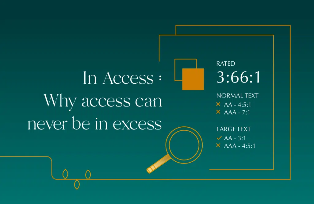
- Colour Contrast of elements will be a key issue. Check and recheck ever colour, especially text on colours. Gradients will be a struggle especially if you’re going for AAA rating. According to WCAG 2.1, the background and text colours should have a contrast ratio of 4:5:1 in the case of small text and 3:1 for large text.
- Test, Test and Test Again: The most sure proof way of making your site accessible is old-fashioned manual testing. You will have to test it repeatedly, through multiple tools, over and over again until you resolve all issues. Each tool will highlight slightly different issues (as no tool is perfect) and they also won’t be able to catch everything. That’s why it’s so important to have a real person use the site with a screen reader or keyboard navigation.
Tools To Transform Your Trade
accessibilitychecker.org, Stark, Wave, Axe Accessibility and ARC Tools
The issue with automated tools is they all return slightly different things. Often, it requires using multiple tools to work out the common issues and locate the actual problem. Having said that, they are vital to getting your website fully accessible. Just be realistic that, unfortunately, there is no shortcut to find every issue.
The Bottom Line
As mentioned, there is no shortcut to an accessible website. The onus is on you, as a web designer or developer, to learn the rules and apply them. This can initially be a slow process of testing and repeating, but it’s ultimately worth it, as a fully accessible website is a better website for all. Plus, remember, the more people that can use your site, the more opportunity for engagement with your business.